GigGo
Reliable job searching for digital nomads
Project overview
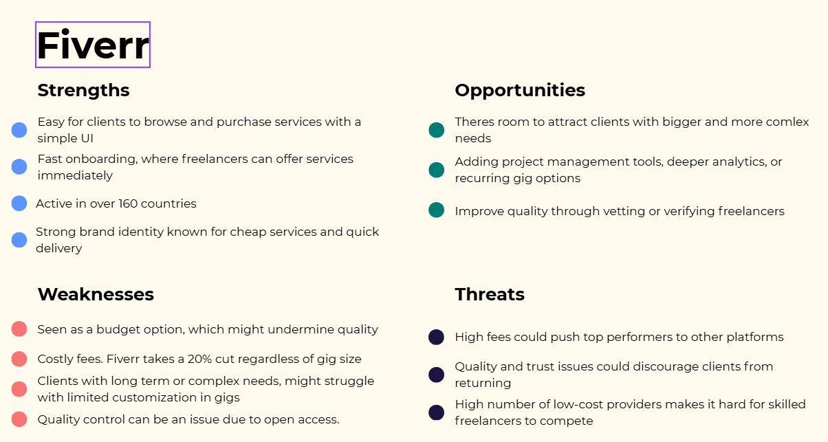
GigGo is a mobile-first app designed to help digital nomads find reliable, flexible work opportunities. Existing platforms like Upwork and Fiverr are saturated, confusing, and often untrustworthy. Our goal was to design a streamlined job search hub that balances flexibility, structure, and trust for nomads who live and work on the move.
Roles
Research, user testing, UI design
Type
Student project
Duration
2 months
*
RESEARCH
* RESEARCH
Research goals
To increase the effectiveness of our research, and to make sure it is centred around our users and their pain points we made the following research goals.
What challenges do digital nomads face when searching for work?
Where do freelance workers prefer to work from?
What motivates them in their job search process?
What features do they look for in a job platform or marketplace?
How do digital nomads typically discover new job opportunities or clients?


Insights
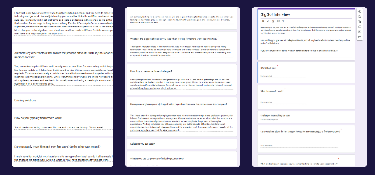
We wanted a good mix of qualitative and quantitative data, so we chose to conduct both literary reviews and interviews. After conducting the research we were left with these insights.
Platform overload: People jump between multiple apps to manage work, leading to inefficiency.
Trust issues: Scams and unclear payment models reduced confidence.
Cognitive overload: Existing apps flood users with information, making job search stressful.
Lifestyle challenges: Nomads juggle timezone differences, unstable internet, and legal/tax hurdles.
*
IDEATION
* IDEATION
Meet Joey
Joey is a 29-year-old UX/UI Designer from Berlin who has spent the last five years working remotely as a digital nomad. He frequently relocates, preferring co-living spaces with strong Wi-Fi to balance work and travel.
His main goals are to secure consistent freelance projects, build trustworthy client relationships, and maintain a healthy work-life balance..
His pain points are needing to navigate multiple platforms to find suitable gigs, lack of trust in job postings and overwhelming amount of information
Problem statement
Travelers often want to make sustainable choices but struggle to make real changes, which causes feelings of guilt and frustration. Even though they know eco-friendly travel is important, they feel overwhelmed by a lack of information and motivation. Without proper guidance, information or personal incentives, many feel unable to help reduce pollution, protect nature, or support local communities. There's a clear opportunity to give travelers the tools they need to make sustainable decisions that benefit both themselves and the world.
HOW
MIGHT
WE
Support digital nomads in maintaining flexibility and control over their work?
Connect digital nomads to relevant, safe, and consistent job opportunities that match their needs and expectations?
Reduce the need for using multiple platforms by providing tools and information in a way that simplifies their job search and workflow?
Make legal, financial, and administrative processes easier to navigate, so digital nomads feel more confident and in control?
Help digital nomads build credibility and trust in a remote world by making their work, skills, and reputation more visible?
Decisions, decisions….
After running our ideation workshops we we were left with two different ideas, to reduce bias in our decision making we used the NUF technique to decide.
Idea 1
Job match & workflow Hub
Key features:
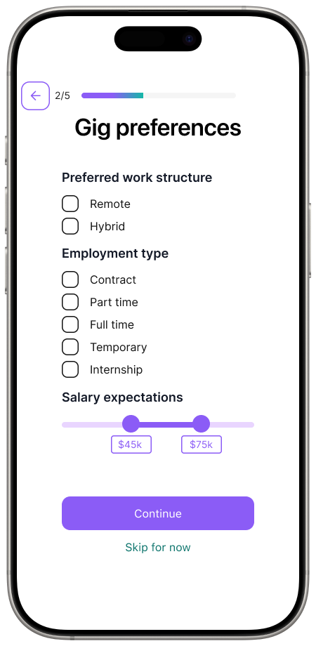
Job filters based on hours, project length, and location to support autonomy.
Central knowledge base with regional filters
Verified clients
Suggested gigs in the dashboard
In-app client chat integrated into each project
Idea 2
Job match & workflow Hub
Key features:
Job filters based on hours, project length, and location to support autonomy.
Central knowledge base with regional filters
Verified clients
Suggested gigs in the dashboard
In-app client chat integrated into each project
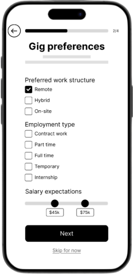
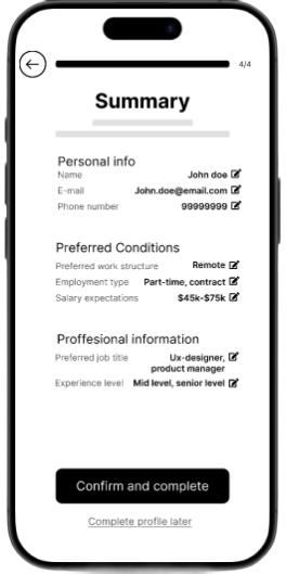
User flow & Information architecture


*
LOW FIDELITY
* LOW FIDELITY
Lo-fi prototype
Since nomads rely heavily on smartphones, we designed for small screens first. Content was vertically stacked, with large tap targets and minimal horizontal scrolling.
Reasoning: Ensures accessibility on-the-go and avoids retrofitting desktop-heavy layouts.
Design decisions
-
Since nomads rely heavily on smartphones, we designed for small screens first. Content was vertically stacked, with large tap targets and minimal horizontal scrolling.
Reasoning: Ensures accessibility on-the-go and avoids retrofitting desktop-heavy layouts. -
Each screen focused on a single primary task (e.g., finding a job, filter, apply).
Reasoning: Users already experience overload on platforms like Upwork; reducing visible choices lowers cognitive effort. -
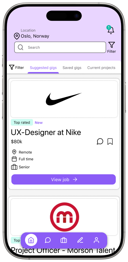
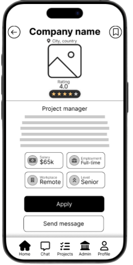
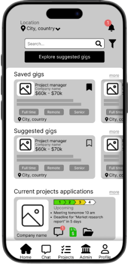
Used card-based job listings, similar to LinkedIn Jobs or Upwork. Applied a bottom navigation bar with 4 key sections (Home, projects, chat, admin and profile).
Reasoning: Familiar structures reduce learning time and build trust. Users don’t want to “figure out” a job app from scratch. -
Persistent back button and simple navigation ensured users never felt “trapped.”
Reasoning: Freelancers experiment with searches; we needed to allow quick recovery from mistakes. -
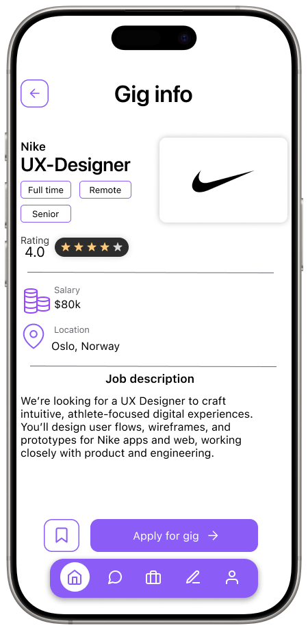
Job title placed prominently at the top of cards. Client name, pay rate, and tags grouped underneath in smaller type. CTAs like “Apply” and “Save” given clear button styling.
Reasoning: Freelancers scan for relevance in seconds; hierarchy guides the eye to critical info first.
User testing
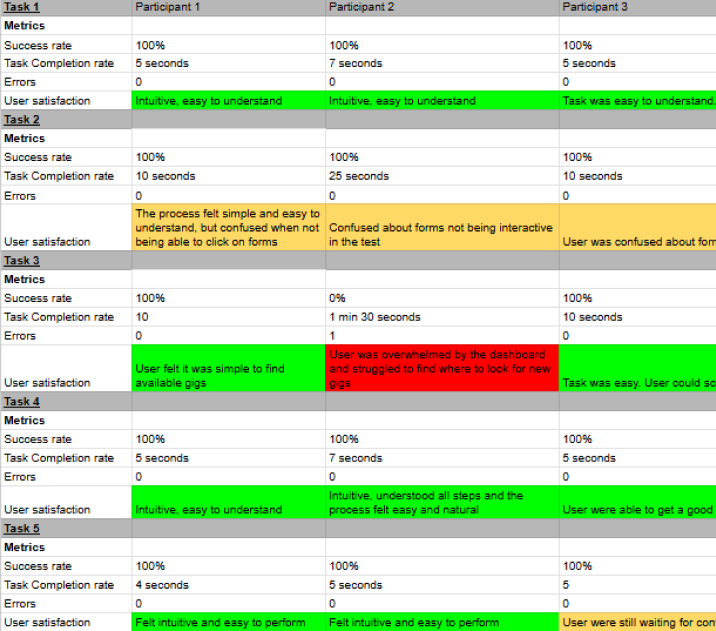
In order to validate our ideas and discover potential issues we decided to test our early prototype. We conducted in person moderated user tests. With a clickable Figma prototype.
-
Register and apply filters
Find a job
Apply for a job
Save a job
Navigate to profile
Navigate to chat
-
Task success rate → Did users complete the scenario?
Time on task → Did they hesitate?
Errors → Misclicks, confusion.
Think-aloud feedback → Where they hesitated or felt
We discovered
The app felt intuitive and easy to use.
Flow was familiar, users quickly understood how to search and apply.
Hard to identify new gigs. Dashboard feels overloaded and creates confusion.
Confusion due to similarities in saved and suggested gigs.
and iterated
Split dashboard into switchable views to simplify the experience.
We also wanted to change the card design to be less crowded as users felt an overloaded by information
As users were happy with the overall navigation and flow of the app no changes where made here.
*
HIGH FIDELITY
* HIGH FIDELITY
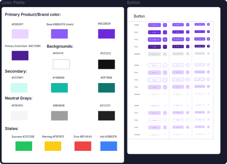
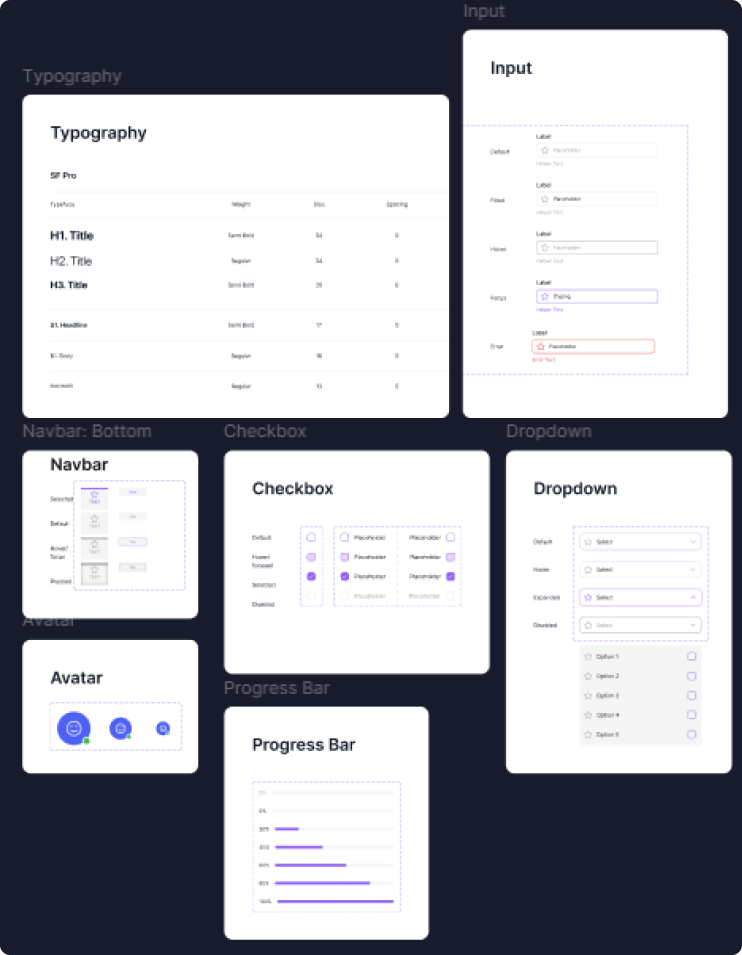
Design system
Why?
Consistency across screens
In early wireframes, we noticed small inconsistencies in button sizes, font hierarchy, and spacing. Establishing a design system ensured every screen felt unified and professional.
Scalability for iteration
We knew user testing would lead to changes. By defining reusable components (atoms, molecules, organisms), we could update one element and have it cascade across all designs saving alot of time.
Efficiency in collaboration
Working as a team meant different people touched the same screens. The design system acted as a single source of truth, reducing misalignments in style and structure.
Trust through familiarity
Users associate visual consistency with credibility. A job platform must feel reliable; repeated patterns (e.g., job cards, input fields) reinforced that perception.
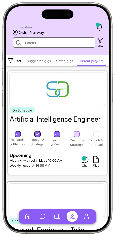
Hi-fi prototype
With our design system finalized, and knowing that what changes needs to be made to our structure, we were ready to create our final prototype.

Design decisions
-
Clean UI with whitespace, soft color palette, and uncluttered layouts.
Reduced text-heavy screens such as dashboard into more organized screens through chunking. We changed the dashboards into switchable views, and improved the card design by utilizing more whitespace highlighting only important information, these changes were directly linked to our feedback from user testing.
Why: Minimalism reduced cognitive load and supported scannability. -
Professional color palette for credibility, keeping color use to a minimum, using it mainly for important CTA.
Larger, bolder headings for hierarchy.
Why: Users associate color/typography with professionalism. -
Success messages after applying or saving.
Inline form validation (errors highlighted in real-time).
Button hover/tap states.
Why: Users need reassurance their actions worked; feedback creates confidence. -
Repeated UI patterns (cards, forms, filters).
Why: Predictability improved learnability and efficiency.
User testing
To see if users intuitively know where to tap/click for key actions (like applying or filtering) We will be using unmoderated First click testing. This will judge the visual hierarchy and content clarity are clear. We will also be conducting moderated single concept preference tests to better judge our visual direction.
We discovered
Overall the users we tested with were satisfied with our solution and validated our design decisions. The design felt clean, modern and intuitive. Through our first click testing we validated that visual hierarchy and content clarity were clear. Participants knew were to click. Through our single concept preference test we were able to validate the visual direction and our design decisions.
We did however receive feedback on icon choices on the bottom nav bar, as they did not clearly convey their function.
and iterated
Change icons on the bottom navigation bar to more clearly convey their function, as well as adding labels to clearly showcase their functionality as well as considering accessibility.