Ecodrift
Sustainable travel planner
Project overview
With the global urgency around climate change and sustainability, travelers are increasingly looking for ways to minimize their carbon footprint. Yet, planning sustainable travel is often fragmented, confusing, and time-consuming. Our project set out to solve this by creating a user-friendly digital platform that helps users plan trips that are both enjoyable and environmentally responsible.
Roles
Research, user testing, lo-fi wireframing
Type
Student project
Duration
2 months
*
RESEARCH
* RESEARCH
Research goals
To increase the effectiveness of our research, and to make sure it is centred around our users and their pain points we made the following research goals.
What motivates people to choose sustainable travel?
What kind of solutions do people already use for planning travels?
Why would people consider traveling with sustainable and eco-friendly solutions?
How can we motivate users to choose sustainable traveling solutions?
Where and when will the product be used?
Insights
We wanted a good mix og qualitative and quantitative data, so we chose to conduct both literary reviews and interviews. To get a better understanding of the solutions that exist today we also conducted a SWOT analysis of some competitors.
Lacking motivation: Users are more likely to act when incentivized (points, gamification, community)
Low awareness: Most users don’t understand the impact of their travel decisions
Simplicity: Overloaded apps reduce action—users want intuitive, helpful, and familiar interfaces
Fragmented tools: Few combine transport, accommodation, and activities in one experience
*
IDEATION
* IDEATION

About
Eric is a 28-year-old plumber. He is a commuter and outdoor enthusiast who wants to travel more sustainably, both for daily commutes and long-distance holidays. He’s aware of his carbon footprint and feels guilty but doesn’t know where to start. He wants intuitive, active, and informative solutions that blend seamlessly into his life
Pain points
Limited sustainable travel options
Lacking information about eco-friendly options
Feels guilty about environmental impact
Current tools are fragmented
Motivation
Reduce carbon footprint
Stay active by cycling
Make sustainable travel easy and fun
Balance affordability with eco-friendly choices
Goals
Discover sustainable travel routes (daily & long-distance)
Have a fun, intuitive app that rewards eco-conscious choices
Gain better awareness of his carbon impact
Stay motivated through rewards and gamification
Problem statement
Travelers often want to make sustainable choices but struggle to make real changes, which causes feelings of guilt and frustration. Even though they know eco-friendly travel is important, they feel overwhelmed by a lack of information and motivation. Without proper guidance, information or personal incentives, many feel unable to help reduce pollution, protect nature, or support local communities. There's a clear opportunity to give travelers the tools they need to make sustainable decisions that benefit both themselves and the world.
Workshopping ideas
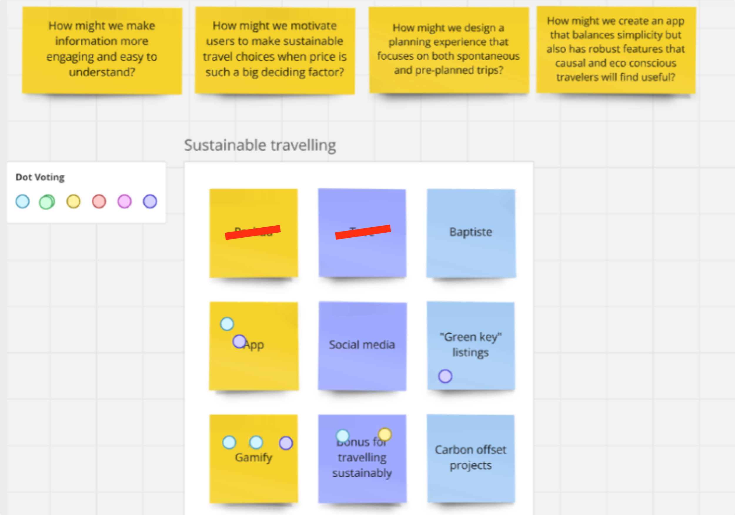
Brainstorming and dot voting to prioritize features
Crazy 8s for divergent concept sketching
*
WIREFLOW
* WIREFLOW
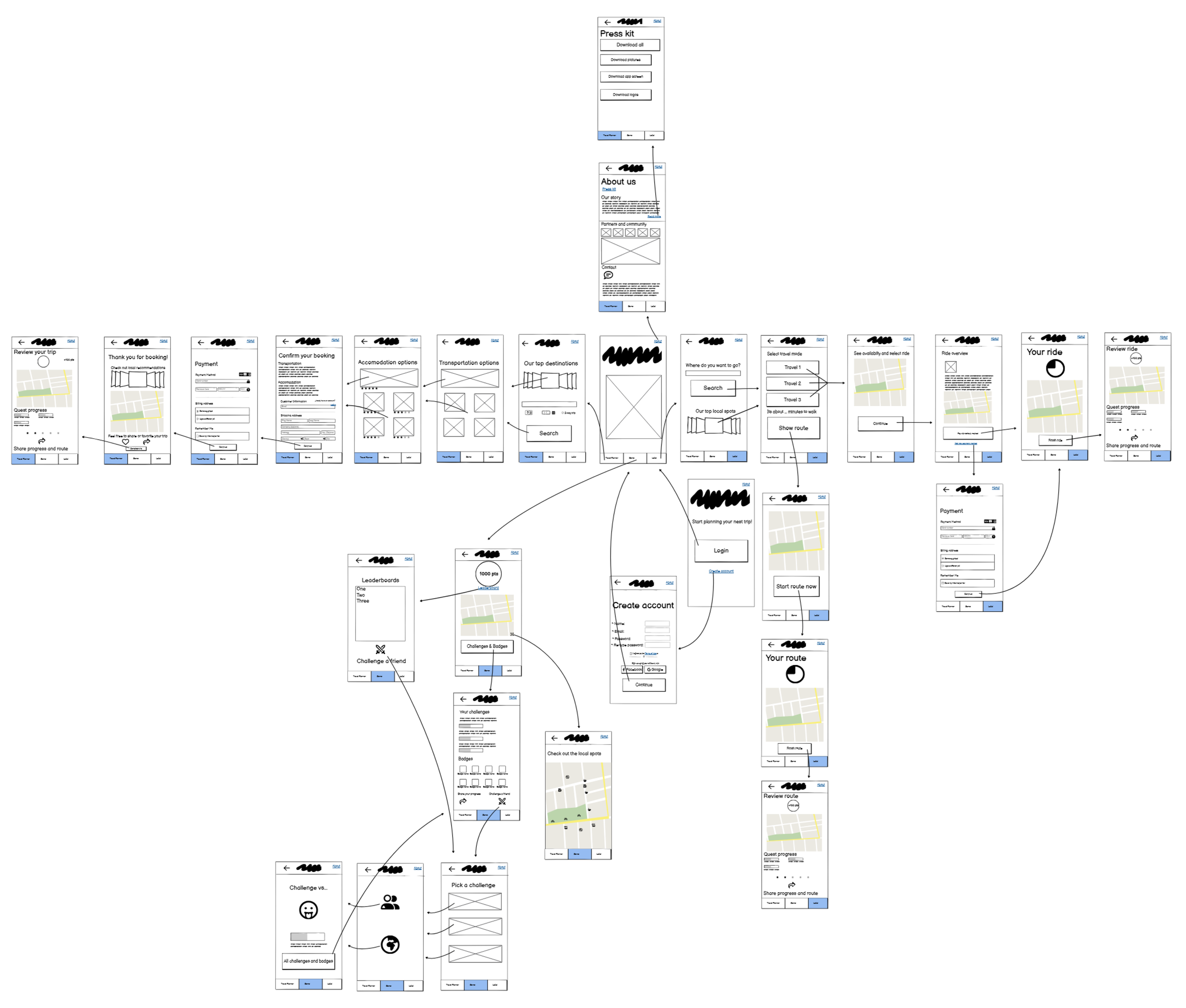
To bring our ideas into a tangible form, we developed wire frames of the app and then turning those into a full wireflow. The goal of this prototype was not visual polish, but to validate the core user flows, information hierarchy, and interaction patterns.
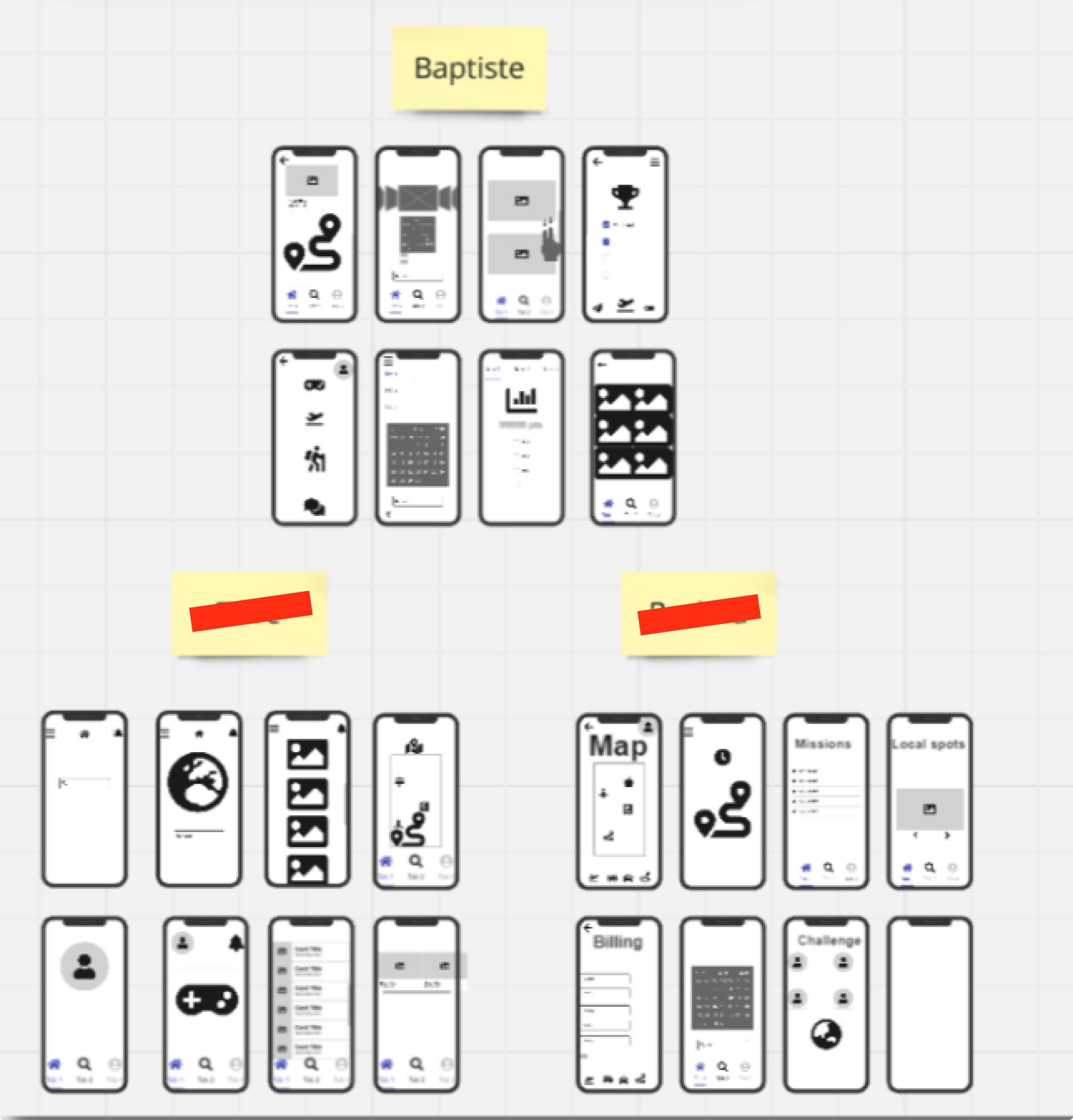
Low-fidelity wireframes
Design decisions
When building the wireflow for the sustainable travel app, every decision was guided by usability principles and persuasive design techniques. Our goal was not only to make the app intuitive and efficient, but also to motivate users to choose sustainable travel.
-
Clean layouts with whitespace and minimal elements.
Lowers cognitive load, reduces overwhelm, and sets an emotional tone. -
Clear bottom navigation bar and large back button.
Ensures users never feel “stuck” and can easily retrace steps. -
Maps integrated into trip planning and local activity discovery.
Leverages how people naturally think of travel spatially.
Makes eco-friendly routes more tangible and easy to understand. -
Progress bars during booking and planning.
Reduces uncertainty in longer or multi-step tasks.
User testing
We recruited frequent travelers from our network (friends and family who use travel apps regularly). While informal, this pool aligned closely with our persona: people who value convenience but are open to new sustainable solutions.
Methods
Moderated & unmoderated sessions
Remote & in-person testing
Tasks focused on core flows like login, trip planning, booking, billing, and reviewing trips
Results
We were able to validate that the core flow was strong and easy to follow. But we realized our assumptions about login flow and gamification clarity were wrong. What felt clear to us as designers didn’t translate to users.
The good
Design: Users liked the clean, simple interface, noting it felt familiar and easy to learn.
Navigation: The bottom menu and flows made sense, and most participants reached their goals with little help.
Overall Experience: Users reported that the app felt modern and aligned with how they already plan trips online.
The bad
Buttons too small: Frustrated some users.
Task flow order:
Login came too early. users wanted to explore first.
“Review Trip” appeared immediately after booking, which felt out of place.
Feature clarity: Some functions like points, challenges, and transport choices confused users. They weren’t sure if they were selecting a mode of transport or a specific time.
Missing features: Users wanted success messages, curated suggestions, hotel reviews, and options to book extras (rental cars, airport transport).
Recommended iterations
-
Enlarge buttons. Better accessibility and reduced frustration.
Move login/signup later. Let users explore the app before committing, which increases trust.
Reposition “Review Trip”. Place it after travel completion, not during booking.
Clarify features. Points, quests, and transport choices need tooltips, microcopy, or onboarding. -
Add success messages. Users want confirmation that actions worked.
Enable booking extras. Extends usability to real-world scenarios. -
Add success messages. Users want confirmation that actions worked.
Enable booking extras. Extends usability to real-world scenarios.
Key takeaways
User testing reinforced the importance of not designing in a vacuum. While we were excited about gamification and our clean layout, users reminded us that:
Clarity beats cleverness. If users don’t understand points or challenges, they won’t use them.
Familiarity builds trust. Features like hotel reviews and curated suggestions are “industry standards” (Jakob’s Law) that users expect.
Motivation must be balanced with usability. Rewards and social proof work only when the basics (buttons, navigation, clarity) are solid.
Positive: We walked away confident that our concept works, with clear next steps for improvement. Negative: The tests exposed just how easily a confusing flow (like login too early) can break user trust.
Future considerations
Our process reminded us that designing for behavior change (eco-friendly habits) requires both usability and motivation. Users won’t change habits just because the app is “good for the planet” it must also be:
Familiar and trustworthy
Easy to use
Rewarding and engaging
Complete enough to feel practical
The biggest mistakes we made were assuming clarity, forcing early commitment, and underestimating industry standards. By testing and iterating, we learned that usability issues and missing basics can derail even the most well-intentioned persuasive design.