MyHealth

In this task we wanted to help users with type 2 diabetes or at risk monitor and manage their health through nutrition and lifestyle tracking.
Project overview
Type
Student project
Duration
2 weeks
Roles
UI-design
*
RESEARCH
* RESEARCH
Identifying oppertunities
To better identify key features, user experiences, and market positioning we started by analyzing some competitors, we aimed to uncover strengths and weaknesses, understand user needs more deeply, and ultimately create a more effective and engaging tool for diabetes management.
Insights
We turned our insight into the following actionable design decisions
Focus on spacing and hierarchy
Use tooltips to reduce graph clutter
Maintain a friendly but clean visual identity
*
IDEATION
* IDEATION
Sketches

We began with hand-drawn sketches to explore layout ideas, prioritizing user flow and data hierarchy. And moved on to creating a low fidelity mock-up.
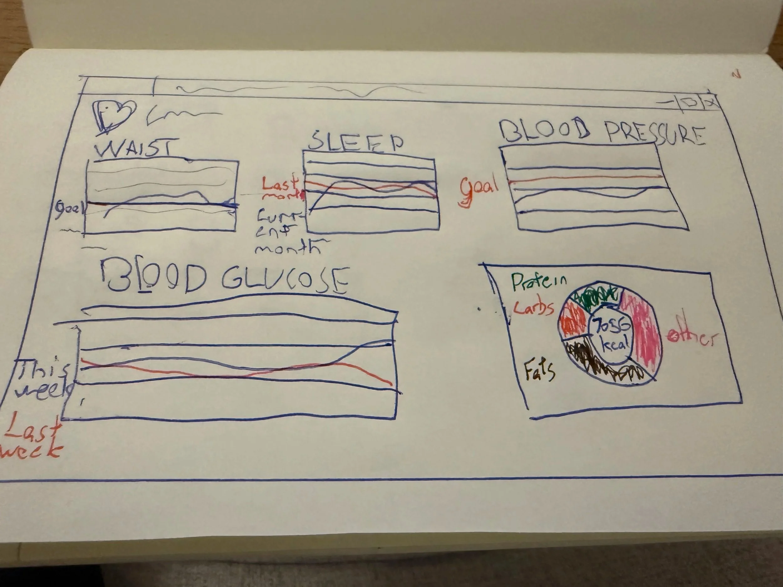
Low fidelity mock-up
*
FINAL DESIGN
* FINAL DESIGN
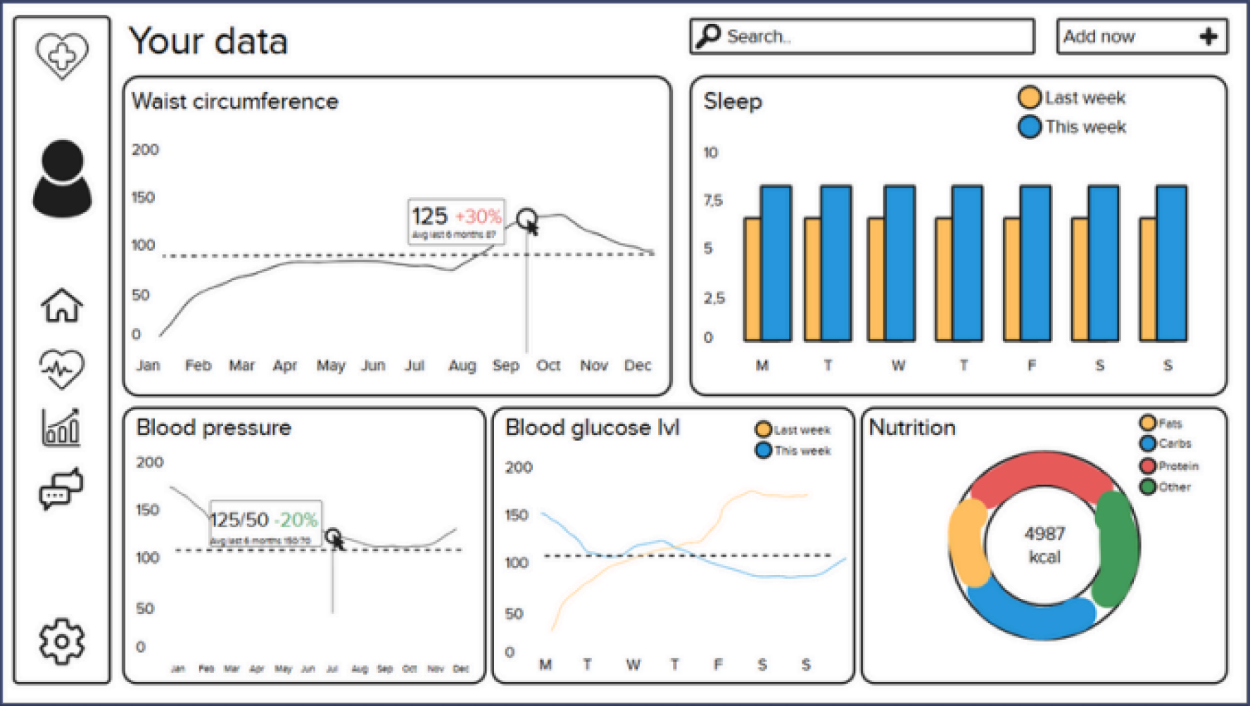
Final mock-up
Our main goals were hierarchy, readability, consistency, and clarity, ensuring users can quickly grasp important health data without feeling overwhelmed.
Design decisions
-
Used bold typography for titles and key stats to enhance visibility
Highlighted important metrics (e.g., goals, averages) with colored boxes
Applied varied chart types to maintain visual interest and reduce overload -
Chose a tile-based layout for clear visual separation and alignment
Used consistent icons and typography for a cohesive look
Applied adequate spacing and padding to keep the design clean and organized -
Designed a simple sidebar navigation for easy user orientation
Removed unnecessary elements to minimize distractions
Used white space strategically to reduce clutter and enhance readability
Created a balanced layout that makes content easier to digest
*
FINAL THOUGHTS
* FINAL THOUGHTS
The design
We were able to validate that the core flow was strong and easy to follow. But we realized our assumptions about login flow and gamification clarity were wrong. What felt clear to us as designers didn’t translate to users.
Lo-fi -> Hi-fi
Progressing from sketches to low fidelity and high fidelity prototypes allowed us to focus on layout and hierarchy, without worrying about final visual details. We were able to focus on how the data and information should be portrayed. I think this is something that really improved our final design.
Hierarchy and variety
We made deliberate design choices to improve clarity and reduce cognitive load. The tile-based layout helped users quickly scan and group related data, while bold typography and color highlights made key metrics stand out. Introducing varied chart types kept the experience engaging and avoided visual fatigue. In hindsight, these decisions helped usability, it made finding information faster and feel less overwhelming by the data-heavy interface.
Future considerations
Overreliance on color in some charts could be less accessible for colorblind users. Missing text labels on sidebar icons impacted clarity and navigation for some users. Some graphs lacked guide lines or markers, making precise data interpretation difficult. Consistency in spacing and layout significantly enhances usability. Accessibility must be embedded early, not treated as an afterthought